THINGS WE LOVE


What could any marketing manager or managing director learn from an evolved version of a fifty-year-old advert, a set of weird and curvy furniture or a demi-god’s adventures outside of the restrictions of time? Let’s find out!
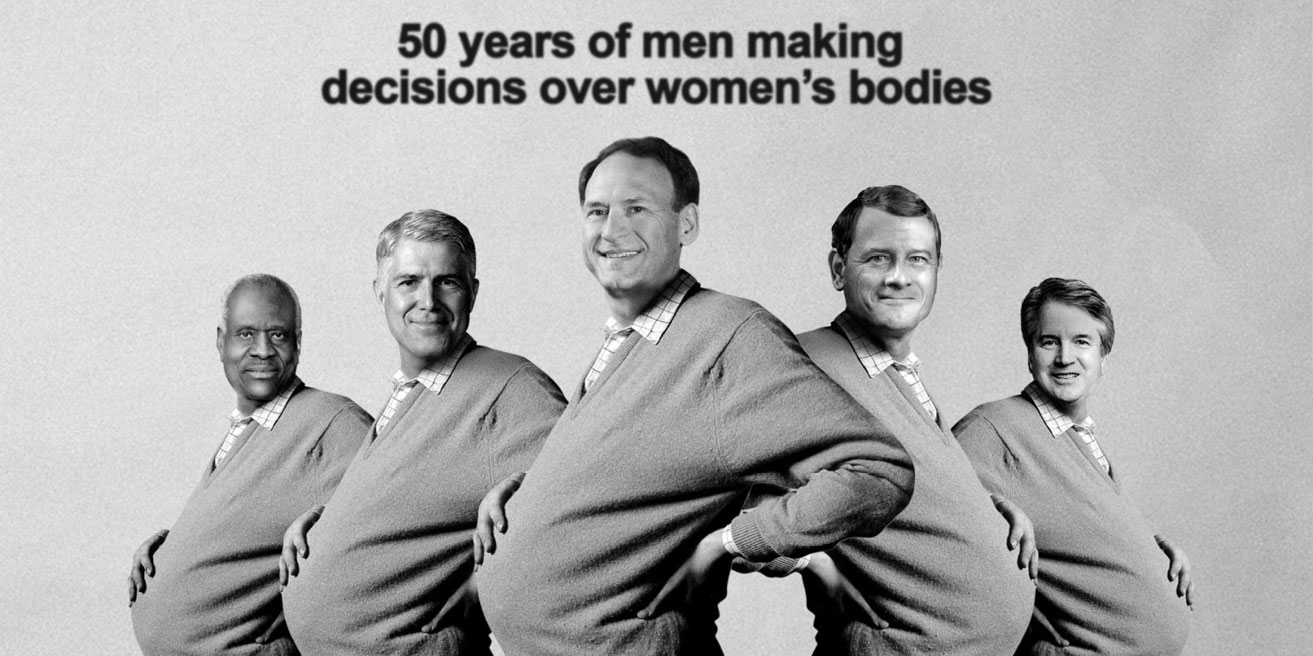
You might wonder why this advert was chosen because it's based on a famous historical piece. However, that's precisely why it's brilliant. Utilising an old advert hammers home how little societal attitudes to women’s bodies have changed and how much US legislation has taken a giant step backwards.
This advert shows that it's worth looking to the past for inspiration. You don't need to be making a point about legislation or society for a look at legacy design to be relevant. Many established, global brands have reviewed their previous logos and branding styles for inspiration in their rebrands. Referencing the past can express that experience, which builds up a sense of trust from your target audience.
Even if your brand hasn't existed for decades, it can still be worth looking at what has gone before to see what has been successful, what hasn't been and what you can learn to determine the path forward for your visual style.

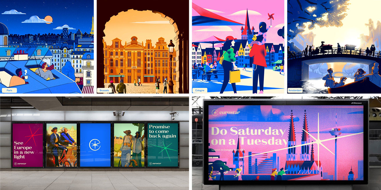
Throughout my career, I have consistently banged the drum of consistency. Why, then, have I included the Eurostar branding when the illustration style is not consistent?
Aside from a beautiful logo and warm colour palette, the varied illustration styles set this branding apart. The inconsistency works because it is done with a purpose. The different styles represent the various cities and cultures that can be accessed by travelling on Eurostar. Together, these styles and illustrations give a beautiful sense of variety.
Even in the inconsistency, there is consistency. The colour palette all the illustrations together. The styles reflect each culture’s personality, yet they still look like part of Eurostar branding. The lesson to learn here is not to be afraid to bend the rules, and if you do, there needs to be a purpose and a framework.
I'm a huge fan of minimal branding. As Dieter Rams famously said: “Good design is as little as possible. Less, but better, because it concentrates on the essential aspects and the products are not burdened with non-essentials. Back to purity, back to simplicity.”
The Nokia rebrand encapsulates this sentiment perfectly. The N, K, and A are missing parts yet are still legible. A crisp, concise, bold design has been created by leaving only the essential parts of the letters. It can be scaled very large and very small and still looks fantastic. It looks clean, modern and efficient – all qualities a technology brand would want associated with them.
Often, less is more. Removing unnecessary detail creates a more potent and more memorable piece of design.


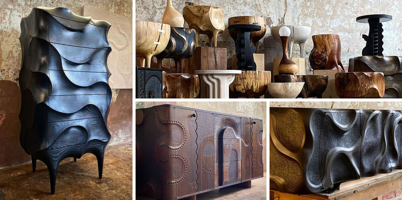
You might have wondered why furniture was included in a graphic design blog. These pieces inspire and can teach us something important about visual design of any description.
The creator of these beautiful pieces of furniture was unafraid of trying something different and designing beyond the expectations people may have for furniture.
In the same way, when approaching any piece of visual design or your branding, don't be afraid to do something unexpected for the format you’re working with. More importantly, don’t be afraid to do something unusual just because no one else in your industry is doing it. Dare to be different! Be brave!
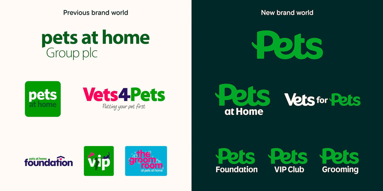
The lesson from Pets at Home’s rebrand is knowing when to rebrand. As you can see in the image below, the old brand world was visually inconsistent, and it wasn't clear that each brand belonged to the Pets at Home family. Therefore, this was an excellent time to consider a rebrand because their audience likely didn’t know that all five sub-brands were in the same group. I didn’t realise Vets4Pets were part of the Pets at Home Group until someone told me! I could sort of see the visual link, but it’s a bit vague.
This problem would have made it harder for them to cross-sell services and products, as there is little portable brand equity and, therefore, trust across the brands. Trust is vital to land sales. That’s a shame because, for example, they could easily sell the veterinary services of Vets4Pets to people who shop at Pets at Home because they’re the same target audience.
In addition, the lack of consistency and scrappy look would have damaged the perception of the whole group and could have been affecting sales. However, the rebrand has reduced the variation between each sub-brand so they all look like part of one group, leveraging brand recognition and trust across the group.
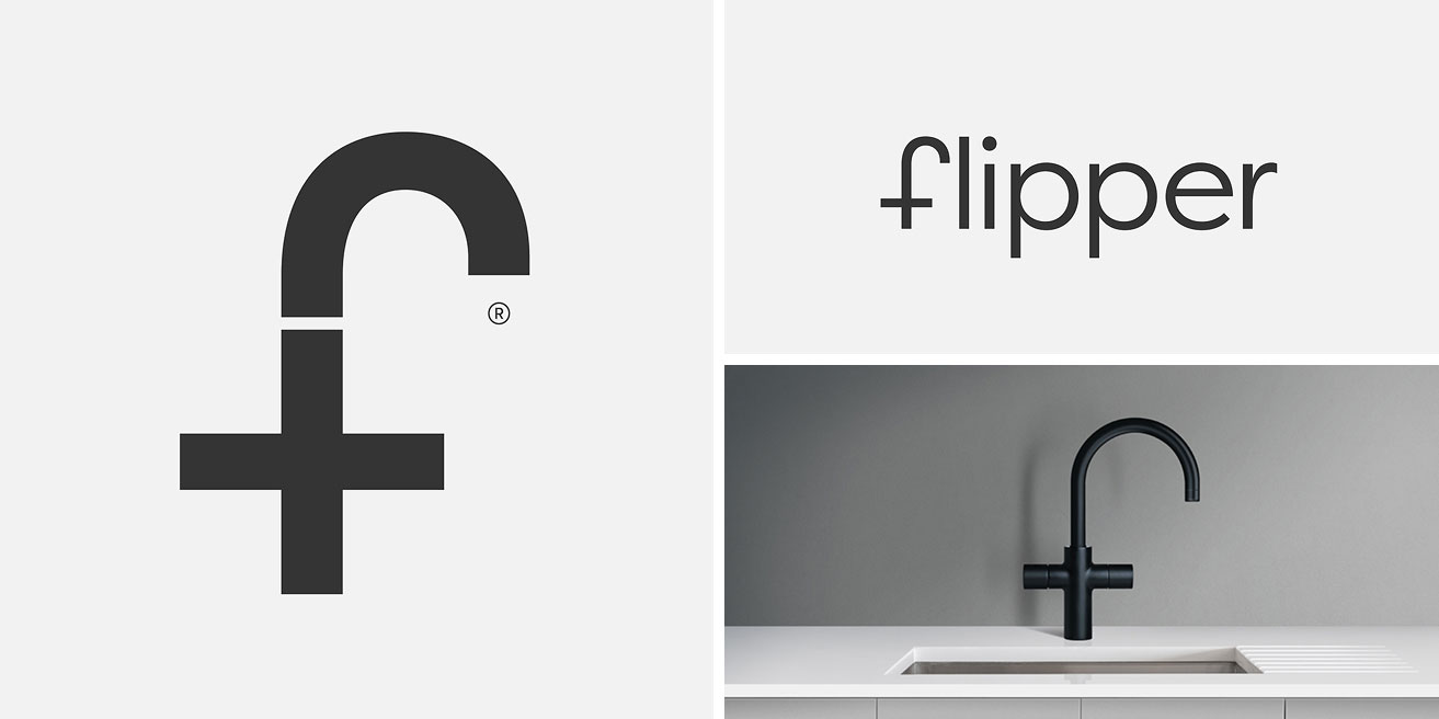
It's so easy to get carried away with overly elaborate or complex design. However, this fantastic branding design is an excellent example of less is more and the power of literal representation. Think Ronseal and "It does exactly what it says on the tin"!
I can’t help but feel that Red Dot Studio, who named the brand and created the design, deliberately chose a name that began with an f because the taps look like lowercase fs. This allowed them to create a logo that looks exactly like what they're selling. This design works because it's really, really simple, making it visually robust and memorable.
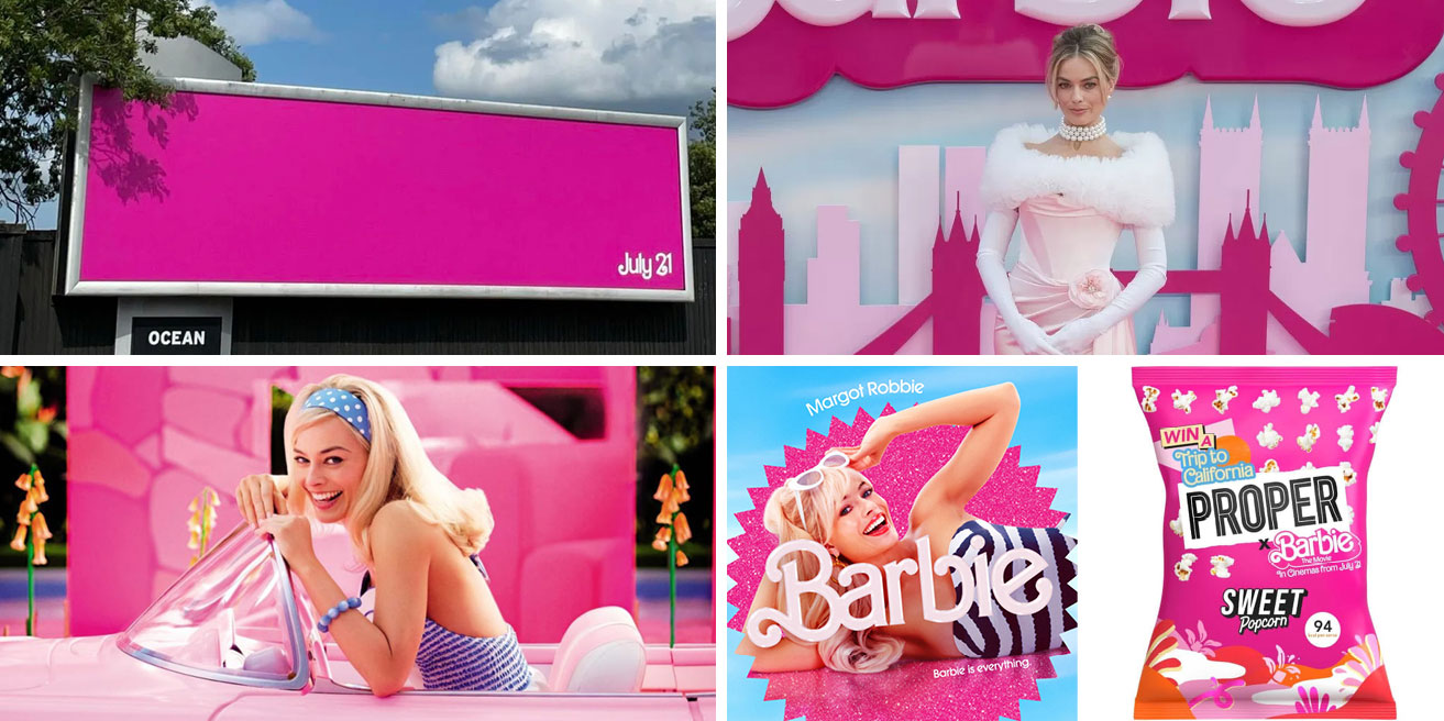
In light of the Barbie movie’s powerful marketing and subsequent success, there has been a lot of discussion about what we can learn from their strategy. Here are three key takeaways:
Firstly, you need to have a solid marketing strategy. Those brand collaborations and perfect details didn't happen accidentally; they were all part of a big plan.
Secondly, know and trust your audience. Every touchpoint and detail was considered with their audience in mind. Creating a billboard in only pink with the release date was a brave move, but it worked perfectly because the creators trusted their audience would know what it was, especially as part of a more extensive campaign.
The third learning is to be completely incessant. The more people see your brand, the more likely they will engage and buy. We can all agree that this marketing campaign was absolutely everywhere, and the movie makers reaped the reward.

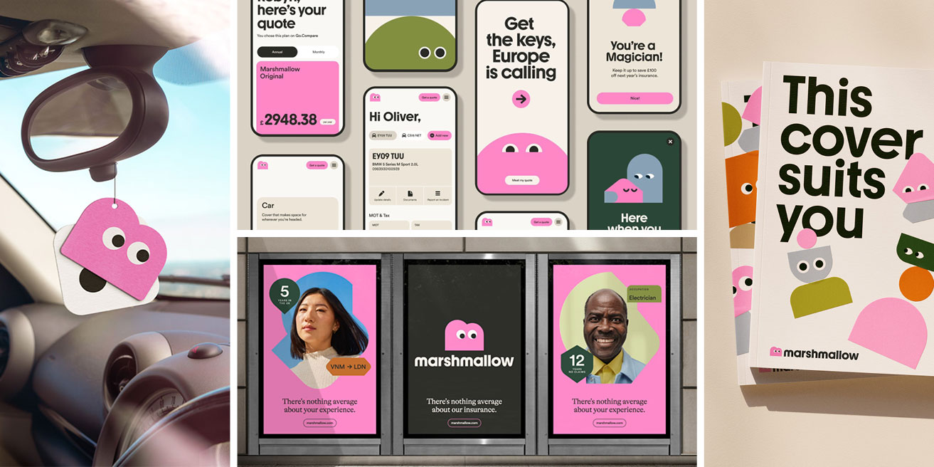
Marshmallow’s branding is so fun and fresh, yet it's for car insurance, but car insurance is boring, right? Think again!
Even if you feel your product or service is not that sexy or exciting, that doesn't mean your branding has to be dull. Have fun with it! Trying something unusual might increase engagement and, therefore, sales. However, make sure any design decisions are based on a strategy and understanding of your target audience.
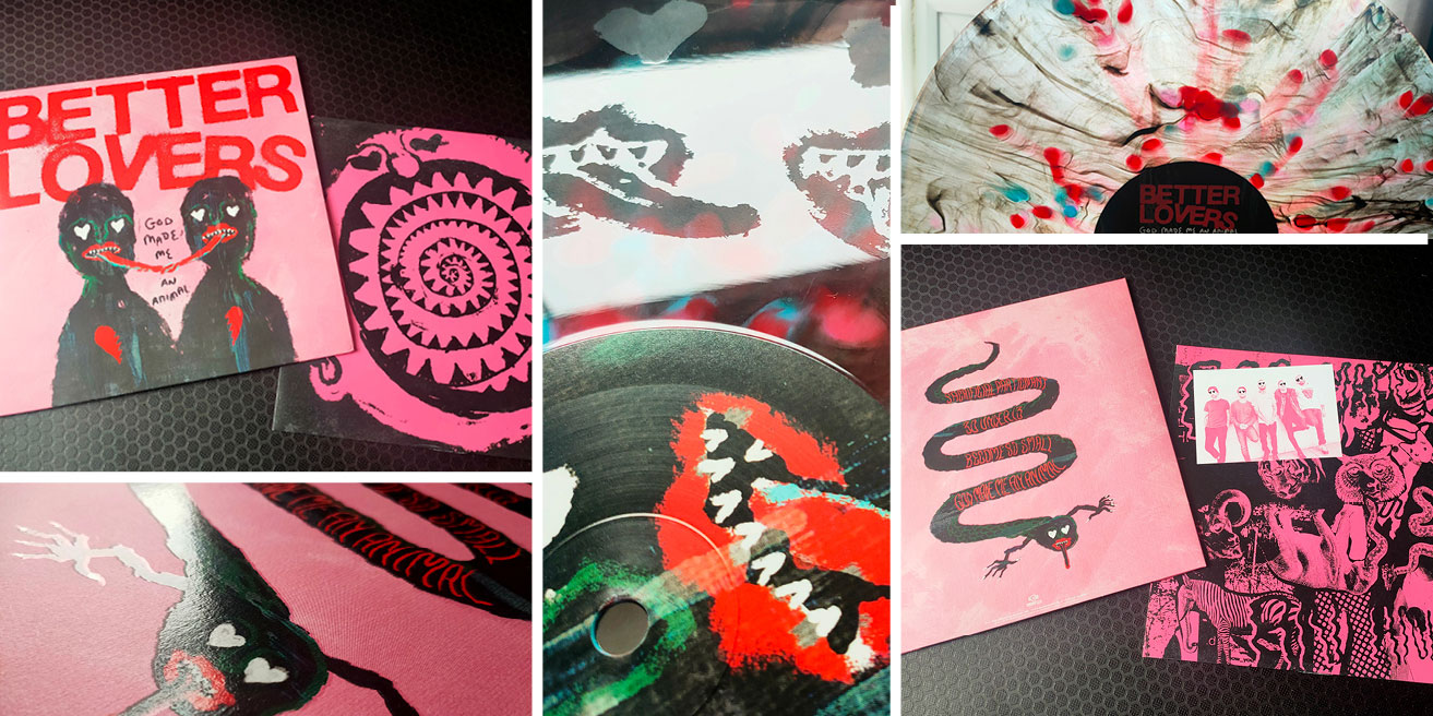
While consistency will build up trust and confidence, the small details can make a difference and make your audience feel valued. The designers went over and above with the Better Lovers EP. Receiving the record felt like a real treat.
Imagine receiving a well-designed brochure from the company you were thinking of buying from that included everything you needed to know, lots of visual details and a beautiful finish. Wouldn’t you feel valued and want to buy from them?

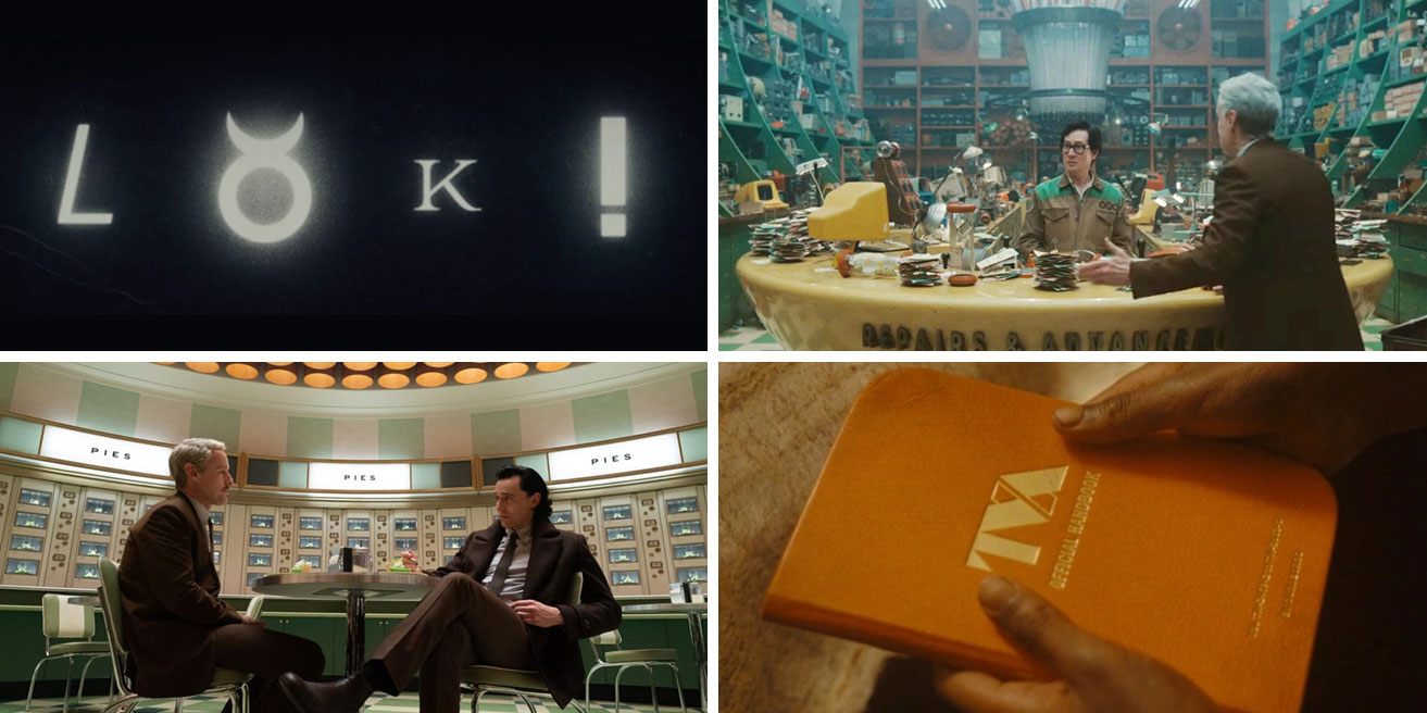
With this design, I am going to go more leftfield. There are lessons to be learned from the visual look of Loki season 2, but I am going to, without providing any spoilers, quote a line from the show that resonated with me.
One of the characters (and I’m not even going to say who) said, “Sometimes it's OK to destroy something”.
What could I convey with this when this is a blog about creativity and making new things? To create something new, we must first make space and let go of things that no longer serve us. Sometimes, that's our branding.
How are your sales and growth plans? Have they stalled? Do you have a product or service that isn’t selling? How consistent is your visual branding? These could all be signs it’s time to make some changes to your branding, which means letting go of branding that is no longer working for your business. It might be time for a branding development or refresh, or it might be time to ditch the whole lot and start again. Don’t be afraid, embrace change!
Feeling inspired? We'd love to help! We are a team of collaborators that enjoy nothing more than partnering with ambitious clients. Get in touch if you'd like to talk through your next project or get some advice.