Things we love 06 DEC 23
Top 10 eye-candy of 2023
At the risk of this becoming a yearly thing, here's a run down of my favourite designs, brand successes and gorgeous things of 2023. Let's focus on the positives and celebrate my top 10... needless to say, Twitter's disastrous rebrand to X has not been included...!


In this year's top 10, I've included more 'non-graphic design' than last year as visual stimuli from all media inspire me, so it would be foolish to rule out some of these choices purely based on what format they have been created for.
Similarly to last year, I've ranked these roughly in chronological order that I saw them rather than in order of preference. I found it hard enough to make a list of just ten without prioritising further!
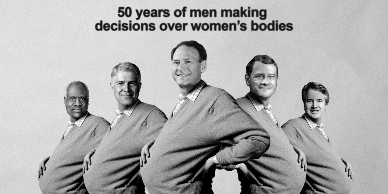
1: Roe v Wade 50th anniversary Pregnant Man ad
Design is broadly about solving a problem. Sometimes, that problem is a political, societal or ideological one. 2023 marks the 50th anniversary of the Roe v Wade lawsuit in the US when women were granted the right to abortion.
At the time, Saatchi & Saatchi London celebrated the ruling with the now-iconic Pregnant Man campaign for the Health Education Council. However, 2022 saw those rights removed from the US Constitution, leaving women's healthcare rights up to the state legislation.
Fifty years on, we should be celebrating further progress, but instead, Saatchi & Saatchi highlighted the terrifying leap backwards by reimagining their iconic ad. Keeping the visual close to the original but updating the faces of the pregnant men to the five who sat on the Supreme Court that overturned the Roe v Wade ruling is beautifully concise and compelling.
I can only hope that in another 50 years, we'll have progressed much further!

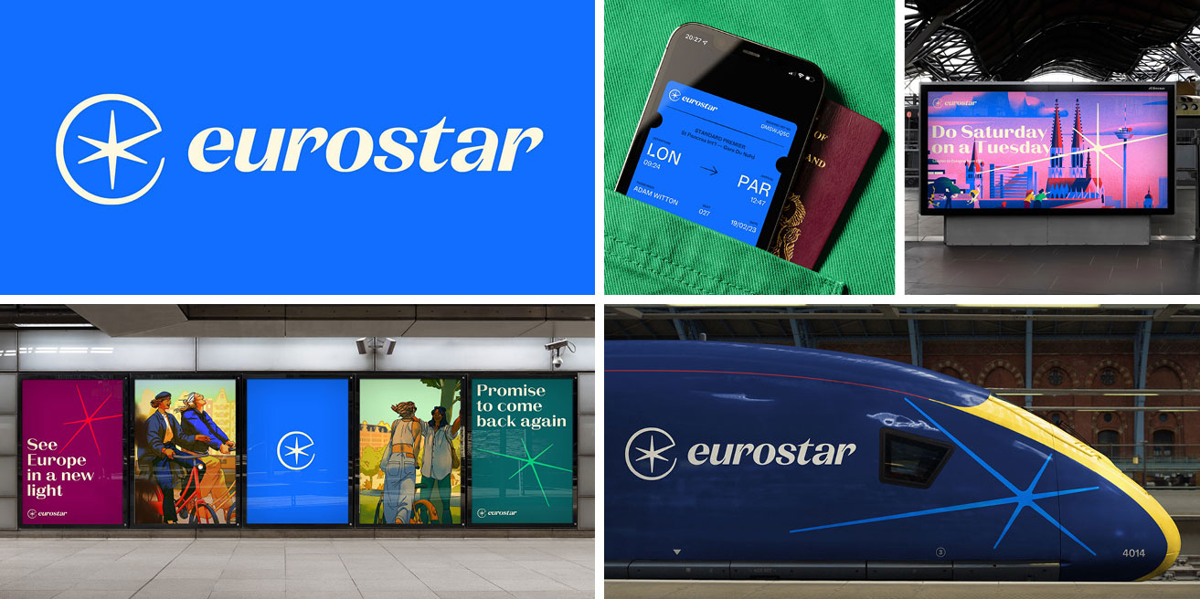
2: Eurostar rebrand
Growing up in Kent, I was a child when the Eurotunnel opened in 1993, and Eurostar was launched the year after; I've been well aware of their branding from the start. Astonishingly, it hasn't been overhauled in all that time – so this rebrand is as welcome as it is overdue.
The styling feels elegant, nostalgic and warm, thanks to a slightly muted but varied colour palette, high contrast sans serif headline typeface and the slender star that features as a graphic device and focal point of the logo. Design Studio commissioned five illustrators to create a suite of illustrations. Ordinarily, this might produce a messy look, but in this context, it works because the colours are consistent, and the deliberately different styles explore the variety of experiences and cultures in Europe. Proof that rules can be broken if it's for the right reasons!
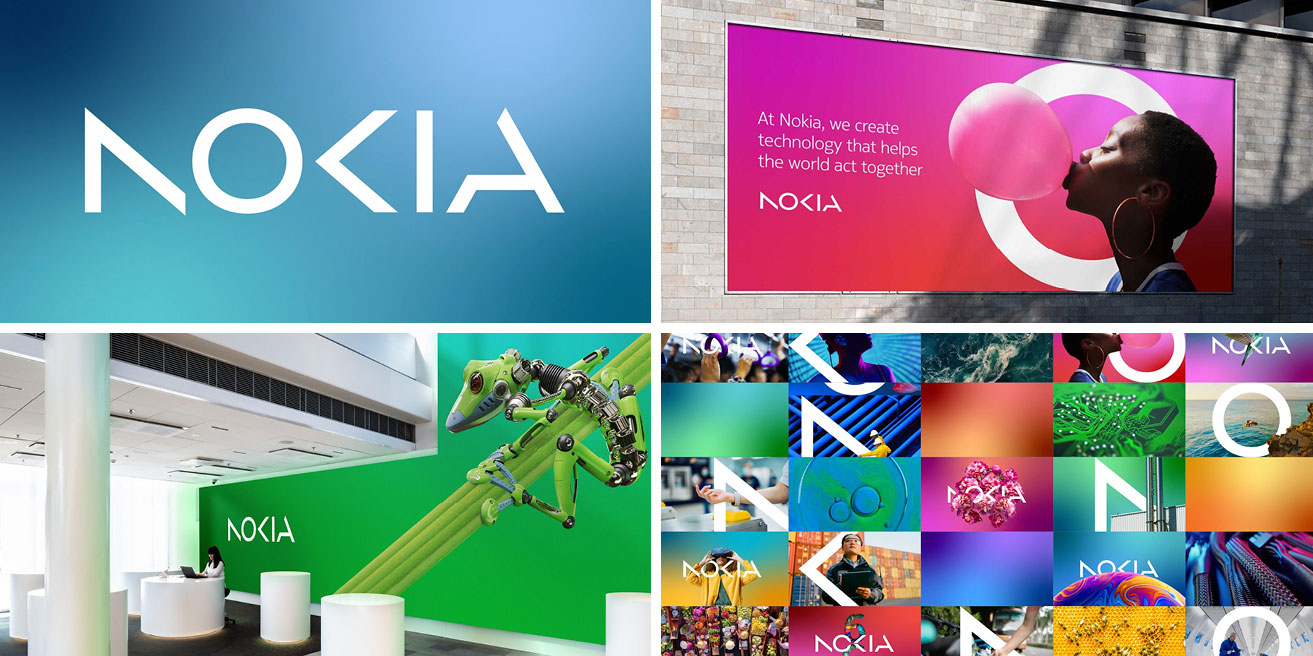
3: Nokia rebrand
While the old Nokia logo is instantly recognisable, it was pretty tired, which isn't ideal for a tech company. I love the simplicity of the new logo by Lippincott – it's crisp and clean and has only the components it absolutely needs for it to be legible. Paired with a vibrant new colour palette, bold photography and soft gradients, the new look feels much more energetic and representative of a brand that wants to be perceived as being on the cutting edge of technology.

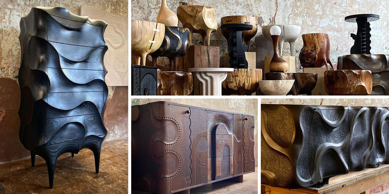
4: Caleb Woodard furniture
I was first alerted to these fantastical pieces by my partner, who shared the chest of drawers on the left with me. I love that they look like they'd been melted and reformed – but are actually made from wood. Caleb hasn't been restricted by traditional ideas of how wooden furniture should look or be created. I'm not entirely sure how practical these are (I think there might be handles set in the curves), but I love the curves and feel. Further exploration on his website reveals a variety of equally beautiful and detailed carpentry. It's a shame these are way out of my price bracket because I would love to own some of them and would take great delight in feeling the smooth curves and intricate details!
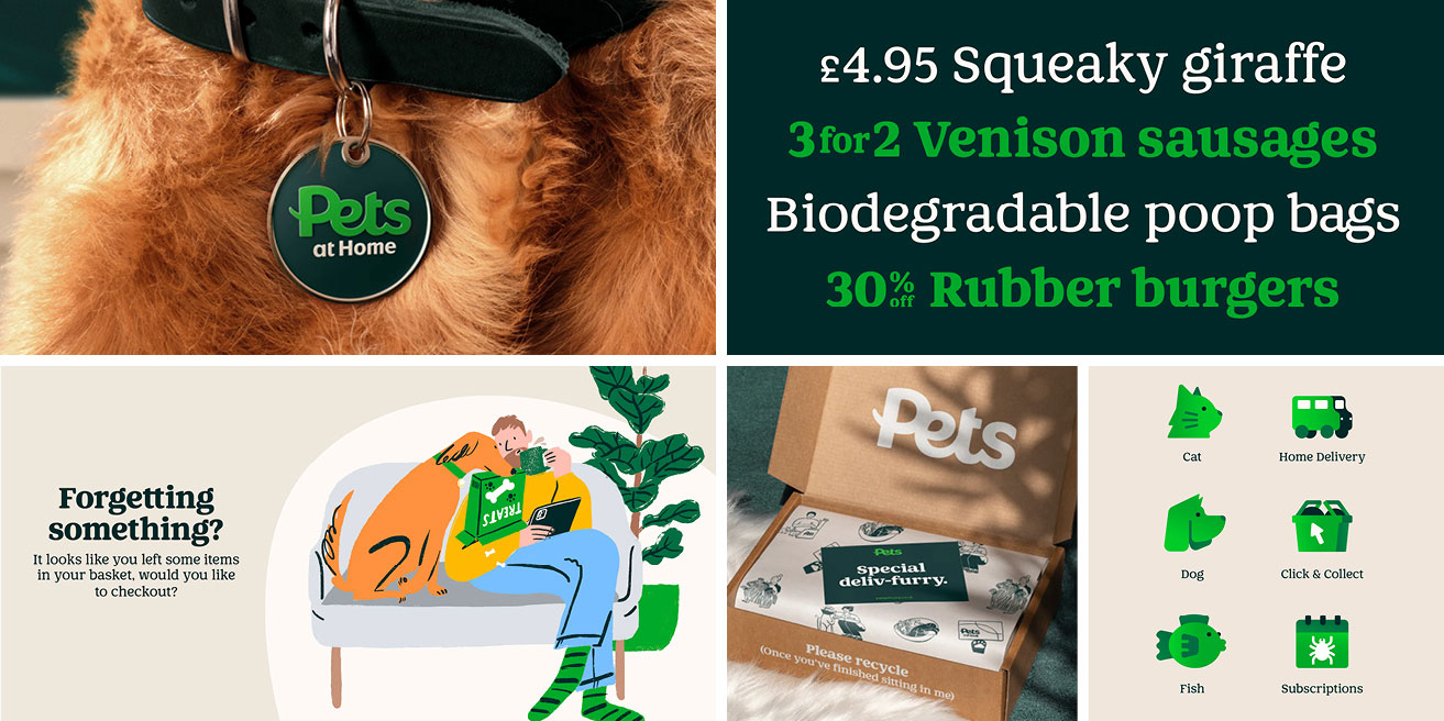
5: Pets At Home rebrand
The Pets at Home Group had done what many growing businesses do – launch different brands under the overarching umbrella at different times, which resulted in a mish-mash in styles. Enter Nomad Studio, who have refreshed the Group's look. The “Pets” wordmark is central to every brand and service in the Group. The letterforms are rounded and approachable, with the cross stroke of the P curling outwards like a tail. It's so simple but effective! The typography continues the cuddly, affectionate look, while the sketched illustration style feels energetic and personal.
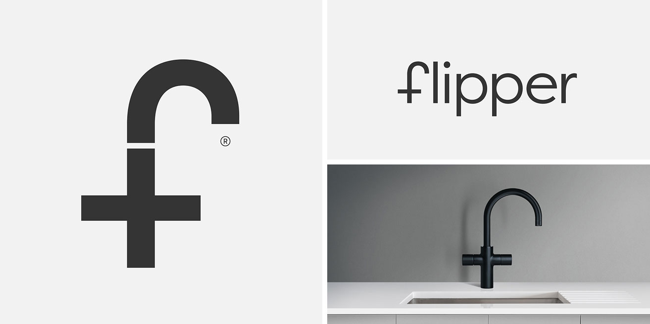
6: Flipper Taps logo
Unsurprisingly, this clever logo design for an innovative 5-in-1 tap brand won a D&AD Yellow Pencil award. Red Dot Studio was commissioned to name the brand and create its visual look. The logo is a minimal combination of the letter F with the shape of the tap and a plus symbol to signify more. Bonus points for the positioning of the Registered mark, like a droplet of water and not too big or too small. Beautiful, concise, effective – less is definitely more.
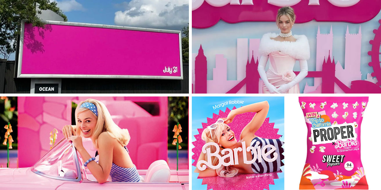
7: Barbie brand success
I couldn't complete this list without including Barbie. From hitting its lowest point in 2014 to the Barbie movie becoming an international box-office smash at cinemas, Barbie showcases the importance of good, consistent branding and a solid marketing strategy. When your brand owns a colour like Barbie owns pink to the level where you can create a billboard in pink with a date, and everyone knows what it’s for – you know you're on to a winner.
Mattel leveraged the brand recognition and brought the campaign up to date with inclusive and diverse storytelling and a multi-platform marketing presence, including social media influencer partnerships, merchandise tie-ins, and interactive online experiences. Even Margot Robbie's outfits from the premiere tour are all inspired by classic Barbie looks. That attention to detail is sure to turn heads!

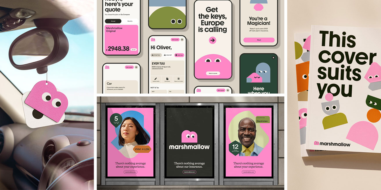
8: Marshmallow branding
I'm always a big fan of unexpected design that pushes clients beyond their industry's standards. Breaking outside of the norms of the car insurance industry, London agency Ragged Edge created this branding for Marshmallow. Their target market is drivers who have migrated to the UK but find that standard insurers fail to recognise their overseas driving experience, resulting in inadequate cover and high premiums. By offering something different, Marshmallow have the perfect reason to look different. This fun, playful branding instantly makes me feel more at ease with the gentle colours, chunky typography and illustrated 'Marshforms' characters. Even the colour palette – consisting of pinks, greens and soft neutrals, is as calming as it is wildly different to other car insurers. Everything has been designed to be inclusive and easy to follow – which is a conscious decision as their target audience’s proficiency in English varies.
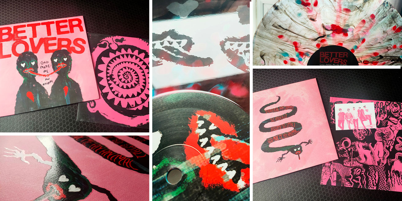
9: Better Lovers EP vinyl design
I can't do a 'best of' blog post without including a record sleeve design! This year, my favourite visual is by a band that consists of my favourite singer with three members of one of my all-time favourite bands... so naturally, I was hyper-excited about their music, and the bonus is this beautiful sleeve design.
I love the merging of hand-drawn illustrations with collage. The overarching colour scheme of pink, red and black marries perfectly with the band name. The hearts over the eyes of the band members in the photo on the inner sleeve are an excellent detail. There’s even spot UV on the outer sleeve, which gives extra tactile, shiny detail.
As with any beloved record, the treatment of the vinyl record itself is part of what makes it a favourite. Not only is this variant a peacock-style mix of reds, blues and black, but the reverse has been etched with hearts and mouths of the creatures (lovers?) on the cover. I love it when bands put this much attention to detail into their merchandise!

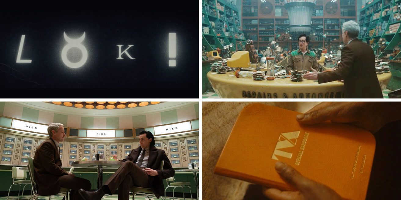
10: Loki series 2 set design, graphic design and visual styling
Loki, played by the brilliant Tom Hiddleston, had a head start in my heart. I think he's one of the most intriguing and well-played characters in the Marvel Cinematic Universe, so it's no surprise I thoroughly enjoyed his first series.
I wasn't expecting such a visual delight with the modernist set designs, strong use of colours (a lot of Loki's staple green, with some orange to contrast and add to that oppressive, overly bureaucratic feeling) and graphic design details.
Everything has been carefully considered, from the brutalist TVA logo to the expansive Blade Runner style views out of the windows at the TVA headquarters. Am I the only one who can ‘feel’ how that TVA Handbook must feel whenever it appears on screen?! Even the main title sequence of the word 'Loki' appearing in different typefaces is simultaneously a typophile's dream and an accurate expression of the God of Mischief.
Season two takes things to a new level with even more cinematically stunning scenes, like OB's first appearance in the Repairs & Advancements workshop and Mobius and Loki discussing the next steps over identical slices of key lime pie in the TVA automat.
A partnership made in heaven?
Feeling inspired? We'd love to help! We are a team of collaborators that enjoy nothing more than partnering with ambitious clients. Get in touch if you'd like to talk through your next project or get some advice.

Recommended
-
-
 Things we love
Top 10 designs of 2022