Branding 05 AUG 22
How can you choose the right fonts for your business?
Fonts are key component of visual branding. Get it right and you have strong, memorable branding. If you get it wrong, you could be sending the wrong message and costing your business. But how do you pick the right ones? Bifrost Founder Jenny Fox explains.


While I think we can all agree Comic Sans is seldom the right typeface for your business unless you work in childcare (and even then, there are a myriad of better choices), making the right selection can feel overwhelming. There are literally thousands and thousands out there, all with unique qualities and personalities.

Font vs typeface
Before we get into the nitty-gritty, let's do a bit of jargon-busting. The terms "font" and "typeface" are often used interchangably but they are actually two different things. A typeface is a set of characters with the same design ethos. It consists of fonts of different weights, styles and sizes. So Helvetica is a typeface whereas Helvetica Bold 10pt and Helvetica Italic 12pt are fonts.
If I'm going to be really pedantic, when selecting fonts for your visual branding, you're initially choosing typefaces (e.g. Helvetica) then drilling down into how those would be used and therefore which specific fonts should be used (e.g. Helvetica Bold for headlines, Helvetica Roman for body text).
Types of typefaces
Typefaces can be grouped into classifications with broadly similar qualities. If you really want to nerd out there are lots of classifications and sub-classifications to learn about. However, when choosing a typeface for your branding it helps if you at least know about some of the major ones. I have listed six:
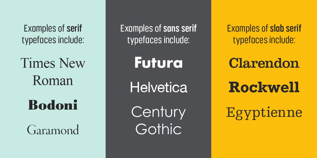
Serifs
- Feature 'serifs' - those little bits that stick out on the ends of some of the strokes.
- Tend to give a more traditional feel.
- Can be used to convey experience and knowledge.
- Can give a historic or nostalgic look.
- Are arguably the most legible for body copy.
Sans serifs
- In contrast to serif typefaces, they do not have serifs and look more modern.
- Simpler forms lend themselves to clear, straightforward messaging.
- They can be used to convey a lot of different feelings, e.g.:
- Rounded sans serifs and ones with more open shapes give an approachable and friendly look.
- Squared and lighter sans serifs give a technical and precise feel. Bold and condensed sans serifs have an impactful look and give a sense of authority or urgency.
Slab serifs
- Combine some of the qualities of serifs and sans serifs, generally looking more modern like sans serifs but with the grounded feel of serifs.
- They can be used to give a harsh, structural look.
- They can be used to show that something is trustworthy, substantial, solid.

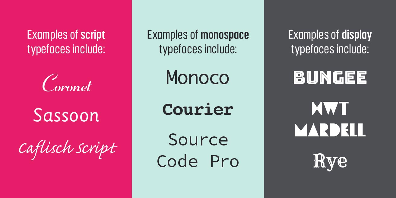
Script
- These are based on handwriting and calligraphy.
- The forms appear more irregular than other typefaces, giving a human feel.
- The natural flow of script typefaces convey a sense of movement.
- They can be used to express creativity, flexibility or something hand-made.
- Due to their more irregular forms, script typefaces are not recommended for large blocks of text.
Monospace
- Each character in a typeface has the same width.
- The strokes of each letter in a typefaces are often the same or have little variation.
- As a result, the letters feel very geometric, rigid and logical.
- They can be used to show that something is technical, digital and therefore looks very modern.
- Because of their inhuman element, monospace typefaces generally aren't great for body text. The regular width makes it harder for people to read.
Display
- These are all very different to each other but as you may have guessed, are all great headline fonts.
- They are not always the most legible typefaces so definitely do not use them for body copy!
- But they have a lot of individual character, some are really experimental.
- Use these sparingly for maximum impact.

Choose a typeface you value
Every typeface has its own personality - the right one for you reflects your values. I definitely recommend spending some time thinking about what your business values are. What makes you different to your competitors? Does your firm have a long history? Is your company at the top, lower part or somewhere in the middle of your market? A core stage in developing really effective visual branding is learning about what you're branding in the first place. When you know what makes your brand tick, you can select typefaces that best represent your values.
Light and elegant or heavy and substantial
Don't forget to investigate the different fonts within your chosen typeface - the bold, condensed, extended, italic versions. A light font with have quite a different feel to a bold extended.
It can be useful to select typefaces that have a lot of weights available for maximum flexibility and to reduce the need for extra typefaces. You could use a bold condensed for headings and a roman for body copy, for example.
Family and friends
It's also worth considering how the typefaces will be used. It's common for visual branding to include at least a couple of typefaces. For example, you may choose a really expressive display typeface or a script typeface for a logo. This could be paired with a more legible slab serif typeface for headings and a sans serif typeface for body copy.
Pairing typefaces is an art form in itself, with few hard and fast rules. There is some guidance out there though and its worth looking at what other people have done for inspiration. Generally it's advised that you don't use more than two to three typefaces, because it tends to look messy and confusing with more.
There are some family typefaces available that make successful pairing really easy. These are different versions of the same typeface, often serif and sans serif versions. Some examples include Roboto and Roboto Slab, Mr Eaves and Mrs Eaves.
Of course, you don't have to do it yourself, you can work with an experienced creative collective, like Studio Bifrost, to sweat the details and get it right for you.
A partnership made in heaven?
Feeling inspired? We'd love to help! We are a team of collaborators that enjoy nothing more than partnering with ambitious clients. Get in touch if you'd like to talk through your next project or get some advice.