
Introduction
81% of us will only buy from brands we know and trust, according to The 2019 Edelman Trust Barometer Special Report1. Branding is one of the key ways to build that recognition and emotional attachment. Therefore, it makes sense to look at brands that have it right and what we can learn from them.
I have chosen three strong brands that have built their success with carefully thought-out branding and messaging.
Who Gives A Crap
Who Gives A Crap is my favourite new brand. I mean, really, it’s just bog roll, but it feels like so much more!
Founded in 2012, Who Gives A Crap was keen to build a brand for a product that everyone needs and use the profits to help people in need. The founders discovered that 2.4 billion people didn’t have access to a toilet, about 40% of the global population. This means around 289,000 children under five die yearly from diarrhoeal diseases caused by poor water and sanitation. The plan was to engage people by talking about what toilet paper is used for, rather than things like puppies and bears and other things unrelated to going to the loo.
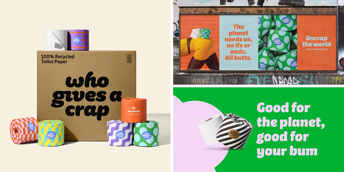
Who Gives A Crap became known for their fun and unusual branding and packaging. They refreshed their look in early 2023, creating a custom typeface based on the logo and using bold, colourful patterns on the packaging. They are now the third biggest toilet roll brand in the UK, despite only being available by subscription.
I made the choice to switch to Who Gives a Crap for all the ethical reasons around reducing plastic usage and deforestation; they give half their profits to charity and the convenience of having a loo roll delivered to my door without thinking about it. Plus, the rolls look far nicer than standard ones in their paper wrappers, and they’re only marginally more expensive than buying from Lidl.
When our first box arrived, my boys were SO excited; you wouldn’t know it was just a bog-standard (pun intended) household!
The tone of voice is cheeky, playful and personal. It feels like real people are behind the brand. The cuddly typeface is simultaneously soft and fun. The eye-catching colours and bold patterns are striking. The paper wrapping is a different tactile experience to traditional plastic wrapping, as well as being a more sustainable choice. All this makes the toilet rolls look great proudly displayed in the bathroom, makes you feel good about doing good and most importantly, makes you want to buy more!

Oatly
The food and drink sector is thriving with sustainable brands, many with well-crafted branding and brand messaging. Oatly is the pick of the bunch.
The Swedish plant-based milk company has been around for over two decades. Initially, it played it safe with its packaging and branding but struggled to gain much traction. With a media budget of just 2% of its giant competitors', Oatly had to find a better way to turn heads.
Oatly got a new CEO, Toni Peterson, in 2012 and he brought with him John Schoolcraft as Creative Director to help him relaunch the brand. This double act is similar to Innocent Smoothies’ double act in the 2000s – founder and CEO Richard Reed and Creative Director Dan Germain. By taking this approach, they could, like Innocent, adopt a completely different and fresh approach.
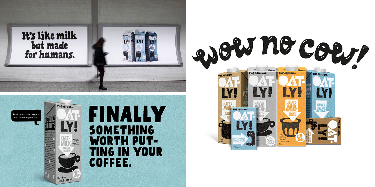
They repositioned as an “activist” brand, with a irreverent, cheeky and fun tone, appealing to younger people interested in a more sustainable lifestyle. The visual style includes hand-drawn lettering, which feels rustic and human, in stark contrast to their traditional dairy competitors. I love that they’ve paired it with a monospace typeface for body copy, chunky illustrations and stark colour palettes. The look grabs attention but in a friendly way!
Oatly turned heads with headlines like, “Wow. No cow!” and “It’s like milk, but made for humans”. The latter upset the Swedish milk industry so much that they sued Oatly! Far from shying away from controversies, Oatly turned this into a PR advantage, taking out press ads to show they were being “bullied”. They have even dedicated an entire website to its history of getting into trouble, which can be found as an Easter egg from their main site.
By committing wholesale to their new brand strategy and following through with industry-defining visual branding, Oatly have grown to become an international success.

Loop
Maarten Bodewes and Dimitri O are two Belgian friends who were frustrated with the lack of good earplugs for going to gigs on the market. They found that most products were ugly, uncomfortable or didn’t stop that annoying ringing in their ears after a concert. They launched Loop in 2016, with the aim to solve all those problems in one product.
Covid proved to be a make-or-break time for Loop; with all concerts and festivals cancelled, and nightclubs and venues closed, sales plummeted. Bodewes said they were "two weeks away from not having any money.".
Bodewes and O recognised markets they could target with their products: parents with children, noise-sensitive individuals, ADHD and autistic people experiencing sensory overload, people who want to focus at work, people who need support in reaching undisturbed sleep, and motorcyclists.
They simplified their packaging and remarketed earplugs as everyday essentials for work, relaxation, and sleep.
Let’s be honest: Loop is not the cheapest on the market, but it has become the market leader by understanding its target audience’s problems and speaking directly to them through carefully crafted branding and shrewd marketing.
Although I already own a pair of earplugs for gigs, I hadn’t thought of Loop as being a product for me. But that changed when I saw that Rox and Rich from ADHD Love had a sponsorship from Loop. They shared a video on Instagram to explain that they help Rox with her auditory processing issues relating to ADHD. As someone with ADHD, I had to look into Loop as a potential solution for the auditory processing problems I have in busy places, similar to Rox’s experiences. I couldn’t find another product on the market that did the same thing, so I bought a pair of Loops. All this because Loop knows recently diagnosed ADHDers like me follow ADHD Love and struck a deal with Rich and Rox!
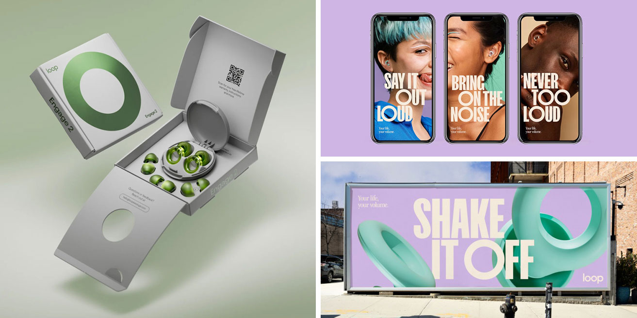
The simple O of the logo echoes the minimal aesthetics of the product and is used prominently throughout Loop materials. It appears prominently on the packaging, so even before you’ve opened the box to reveal the product itself, you know you have a desirable object in your hands. I must admit, I did let out an “ooohhhh” when I saw that box!
The products' colour options are modern and fresh, and this is reflected in their branding colour palette. Contrasting with the circles of the O and logo lettering is a strong, impactful, and bold condensed sans serif typeface used for headings. Combined with very high-quality fashion-style photography, Loop has been marketed as a product of desire and a solution to many problems – which means they are in a position to charge more than similar products on the market.


Conclusion
All three of these brands have different target audiences, different products and solve different problems. But they all have some vital details in common.
Who Gives A Crap, Oatly and Loop all understand their ideal buyers – who they are, where they hang out and what problems they solve for them. This means they have been able to market their products to them in places they know their target audiences will see and engage with their messages.
This knowledge about their target audience means these brands have been able to create visual branding that grabs attention, makes them look distinctly better than and different to their competitors, and accurately communicates the benefits of their products.
Creating trust and desire from their target buyers means all three brands have more control over their product prices because people are willing to pay more for a brand they connect with.
By capturing the attention of their target audiences, these three brands have increased their profits and market shares to become well-known market leaders.

A partnership made in heaven?
Feeling inspired? We'd love to help! We are a team of collaborators that enjoy nothing more than partnering with ambitious clients. Get in touch if you'd like to talk through your next project or get some advice.


