
BRANDING 10 APR 24
Decoding the power of colour in branding: how business owners and marketing managers can use colour to drive sales
Blue is still, by far, the world’s most popular logo colour. Despite being the most unpopular colour, UPS uses brown as its brand colour. But why? And what colour should you choose for your logo and branding?


First impressions are vital. Your logo and branding will likely be your target audience's first contact with your brand, so you’ll want to set their expectations accurately. As explored in Is your branding costing you business?, it’s vital to get your visual identity right.
Successful branding and logo design for your business accurately represent what you offer and your values; you understand your target audience’s challenges and are offering them the solution. As part of robust sales and marketing strategies, fully representative, high-quality branding will help you win business.
Consequently, details like font and colour choices can make a massive difference in how your business is perceived.
In this post, we’ll explore the meanings associated with different colours and methods you can use to select colours that work together. If you’re looking for more technical information, like understanding the difference between RGB, CMYK and Pantone colours, check out Image jargon busting.
Understanding Colour Theory
Let’s start with the basics. Understanding colour theory is the foundation designers use to select colours. It encompasses three primary concepts: the colour wheel, colour harmony, and colour psychology.
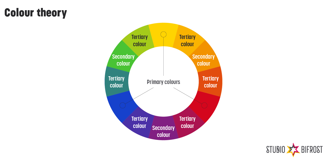
The colour wheel: is a fundamental tool that organises hues into a circular format. It consists of primary colours (red, blue, yellow), secondary colours (orange, green, purple), and tertiary colours (mixtures of primary and secondary colours). This visual representation serves as a guide for creating harmonious colour schemes and understanding relationships between different hues.

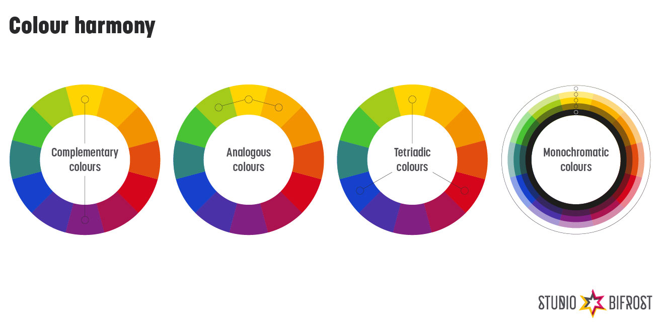
Colour harmony: Achieving colour harmony involves combining colours to create visually pleasing compositions. There are several methods for achieving harmony, including complementary (using colours opposite each other on the wheel), analogous (using colours adjacent to each other), triadic (selecting three evenly spaced colours), and monochromatic. Monochromatic can be limited to just black and white, or consist of black, white, a hue, plus tints (hue + white) and shades (hue + black).
 Colour psychology: Colours have inherent psychological associations that evoke specific emotions and perceptions. Once you’ve developed a solid understanding of your target audience’s needs, what keeps them awake at night, how your amazing product or service will solve their problems, and, therefore, what your brand values are, you can choose colours with the corresponding associated values for your branding. There’s more on this in Why does your target audience matter when it comes to branding and marketing?.
Red means love?
Colours have different associations in different parts of the world and cultures, so you should be doubly mindful of your audience and what colours mean to them before making your choices. For example, in China, red is associated with good luck and marriage, while in South Africa, it’s associated with mourning.
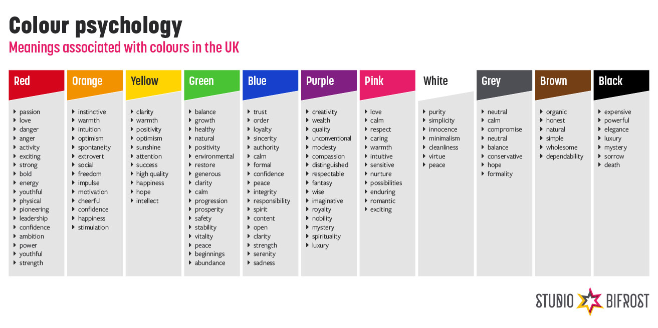
Studio Bifrost is based in the UK, and most of our clients are UK-based, so I’m taking a UK-centric look at the meanings assigned to colours.
- Red: passion, love, danger, anger, activity, exciting, strong, bold, energy, youthful, physical, pioneering, leadership, confidence, ambition, power, youthful, strength
- Orange: instinctive, warmth, intuition, optimism, spontaneity, extrovert, social, freedom, impulse, motivation, cheerful, confidence, happiness, stimulation
- Yellow: clarity, warmth, positivity, optimism, sunshine, attention, success, high quality, happiness, hope, intellect
- Green: balance, growth, healthy, natural, positivity, environmental, restore, generous, clarity, calm, progression, prosperity, safety, stability, vitality, peace, beginnings, abundance
- Blue: trust, order, loyalty, sincerity, authority, calm, formal, confidence, peace, integrity, responsibility, spirit, content, open, clarity, strength, serenity, sadness
- Purple: creativity, wealth, quality, unconventional, modesty, compassion, distinguished, respectable, fantasy, wise, imaginative, royalty, nobility, mystery, spirituality, luxury
- Pink: love, calm, respect, caring, warmth, intuitive, sensitive, nurture, possibilities, enduring, romantic, exciting
- White: purity, simplicity, innocence, minimalism, cleanliness, virtue, peace
- Grey: neutral, calm, compromise, neutral, balance, conservative, hope, formality
- Brown: organic, honest, natural, simple, wholesome, dependability
- Black: expensive, powerful, elegance, luxury, mystery, sorrow, death

Remember that your chosen colour's particular tint, tone and shade also impact perception. For example, light greens are more readily associated with calm, nature and clarity, while dark greens are more often associated with wealth and stability (think British racing green)
Why is blue so common, and why do UPS use brown?
It’s easy to see why blue is the most common colour in logo design. It has become the colour of business with associations that include trust, formality, sincerity, and confidence.
Equally, understanding the associations clarifies why UPS has opted for brown. It makes sense for a delivery service to use brown because it is associated with honesty, wholesomeness and dependability.
In addition, when UPS was beginning to grow beyond Seattle, it was looking for a uniform colour that stated the level of service a customer should expect. Back then, the Pullman Company operated high-end passenger rail cars painted in a brown shade called ‘Pullman Brown’. UPS copied the colour for the uniform and package cars, hoping to bring that level of association with brown and high quality to their brand.
The brown has been paired with a golden yellow, which connotes positivity, happiness, high quality and warmth.
We can tell from this that UPS wants you to feel that their service is high-quality, dependable, and honest, that their customer service is warm, and that you will feel happy to send or receive a package with them. Plus, brown is the most underused brand colour, so they stand out!
The power of colour
It is possible for your brand to ‘own’ a colour. Or, even more literally, actually own a colour like Tiffany & Co. does with Tiffany Blue – the colloquial name for their egg turquoise-blue, which was registered as a colour trademark in 1998. It is even produced as a private custom colour by Pantone.
Barbie’s masterclass in marketing for their 2023 box office success at cinemas included a billboard in Barbie pink with only the release date in the corner. Everyone knew what it was for because that shade of pink with that typeface is SO recognisable.
But what if your business isn’t a household name or a global brand?
While not many brands can completely own a colour like Tiffany or Barbie, you can use it as a point of difference to make you stand out from your competition.
For example, everyone in your natural product brand’s market uses greens, blues, and neutrals. You might want to consider using those colours because they are associated with calm, nature and stability.
But, on reviewing your audience’s needs and what makes you different to your competitors, you want to reflect the warmth of your customer service and positive changes your customers benefit from, so you could include a yellow, orange or make the green a zesty, lime green. Or maybe you stick to softer greens and neutrals but pair them with a rich purple to represent the high quality of your product, personal approach to customer service and a sense of spirituality.
Whatever colours make the final cut, use them consistently. Yellow and red are associated with McDonald's, and purple is associated with Cadbury. That didn’t happen overnight. Each of those brands used their colours consistently across all touchpoints. And they didn’t just use any yellow or purple; they ensured they used the same shades and hues everywhere. We’ve come to associate those colours with those brands through repeated sightings.
Going back to our example, if you consistently use rich purple with soft greens and neutrals for your natural product, your target audience will soon associate those colours with you. Recognition leads to trust, and trust leads to sales. Colour is another tool in your toolbox that can help you win business!

A partnership made in heaven?
Feeling inspired? We'd love to help! We are a team of collaborators that enjoy nothing more than partnering with ambitious clients. Get in touch if you'd like to talk through your next project or get some advice.

