Case Study
Wrexham Food Partnership
Branding system for funded partnership working to reduce food poverty


Objective
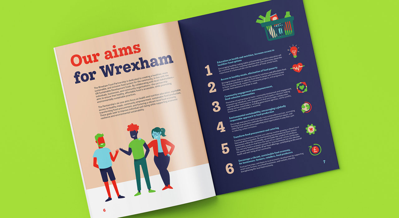
Wrexham Food Partnership is one of over 50 food partnerships across the UK. These partnerships are set up with goals in alignment with the EU Sustainability Goals to bring about positive changes in the food chain for individuals, businesses, and the environment. Their aims include alleviating food poverty, educating and bringing together communities, reducing food miles and waste, and supporting the development of a more sustainable, profitable, and diverse food supply for all.
These partnerships operate under the Sustainable Food Places umbrella but have their own branding. Therefore, Wrexham Food Partnership needed its identity to represent its objectives and inspire action.
The Partnership's broad remit and reach meant that its visual branding needed to appeal to a wide audience, including individuals in the community, producers and suppliers in the food chain, and organisations in the partnership. An initiative like Wrexham Food Partnership typically involves many decision makers – within Wrexham Borough County Council, who funded the project, a steering group, and Food and Drink Forum, who collaborated with the Council to set up the Partnership.
All this creates quite a broad brief and a substantial undertaking. However, Studio Bifrost has enjoyed a long relationship with Food and Drink Forum, so we were a natural choice to be chosen as the design partner for this project.

Creative
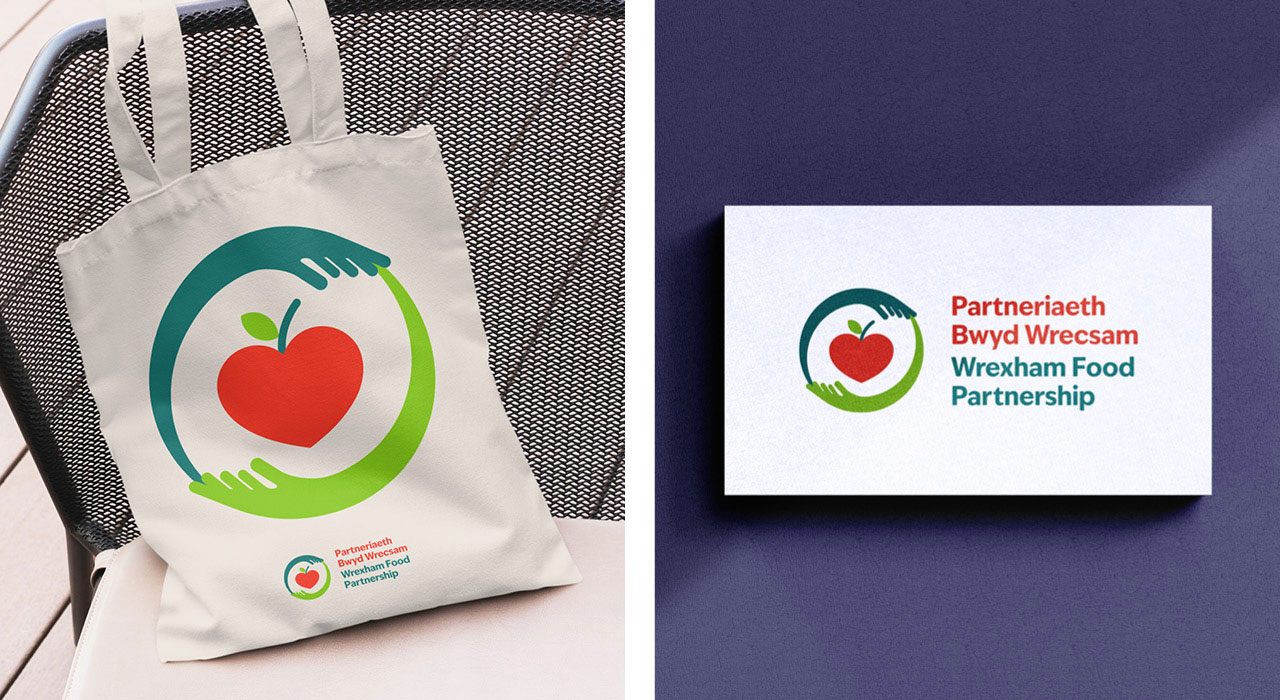
Given the very broad audience Wrexham Food Partnership's visual identity needed to appeal to, the logo needed to clearly represent both the food and drink industry and sustainability.
The apple shaped like a heart in the centre of the logo simultaneously represents food and caring for each other, for the community and for the planet. The two arms flowing around the heart apple represent the Partnership working together and is reminiscent of a lot of iconography within sustainability. The arms create a circle to represent the planet.
We found in our research that good is unavoidable in food partnership branding because there are so many advantageous connotations. It is a colour found in many fruits and vegetables, looks fresh, represents sustainability, ethical qualities and positivity.
However, we selected a dark green is more teal than green, which gives a point of difference and adds a more formal business look. The red is an orange-red to give more to give a more energetic look than a flat red.
The final output was nothing short of fabulous! The branding has been incredibly well-received, and it perfectly captures the essence of the Partnership. Studio Bifrost’s attention to detail, combined with their flair for design, resulted in branding that is not only visually appealing but also impactful and memorable.
Trudi Waldram
Senior Projects and Engagement Manager, Food and Drink Forum

We selected a rounded sans serif with varied stroke widths. This simultaneously feels a little more human than a fixed-width stroke but maintains a structured feel for a professional look.
While the logo contains colours seen in foods, the supporting palette includes colours that are reminiscent of the outdoors and fresh air. We've included a mix of warm and fresh colours. The deep purple-blue underpins the palette for contrast and to add a formal edge.
The brand typefaces include a rounded slab serif typeface that looks substantial and trustworthy as the headline typeface. The rounded terminals on some of the letters, like the ‘a’ and ‘y’, add to the approachable and human look.
A clean and functional sans-serif typeface has been chosen for body copy. This contrasts with the rounded and chunky shapes in the logo and headline-type faces.
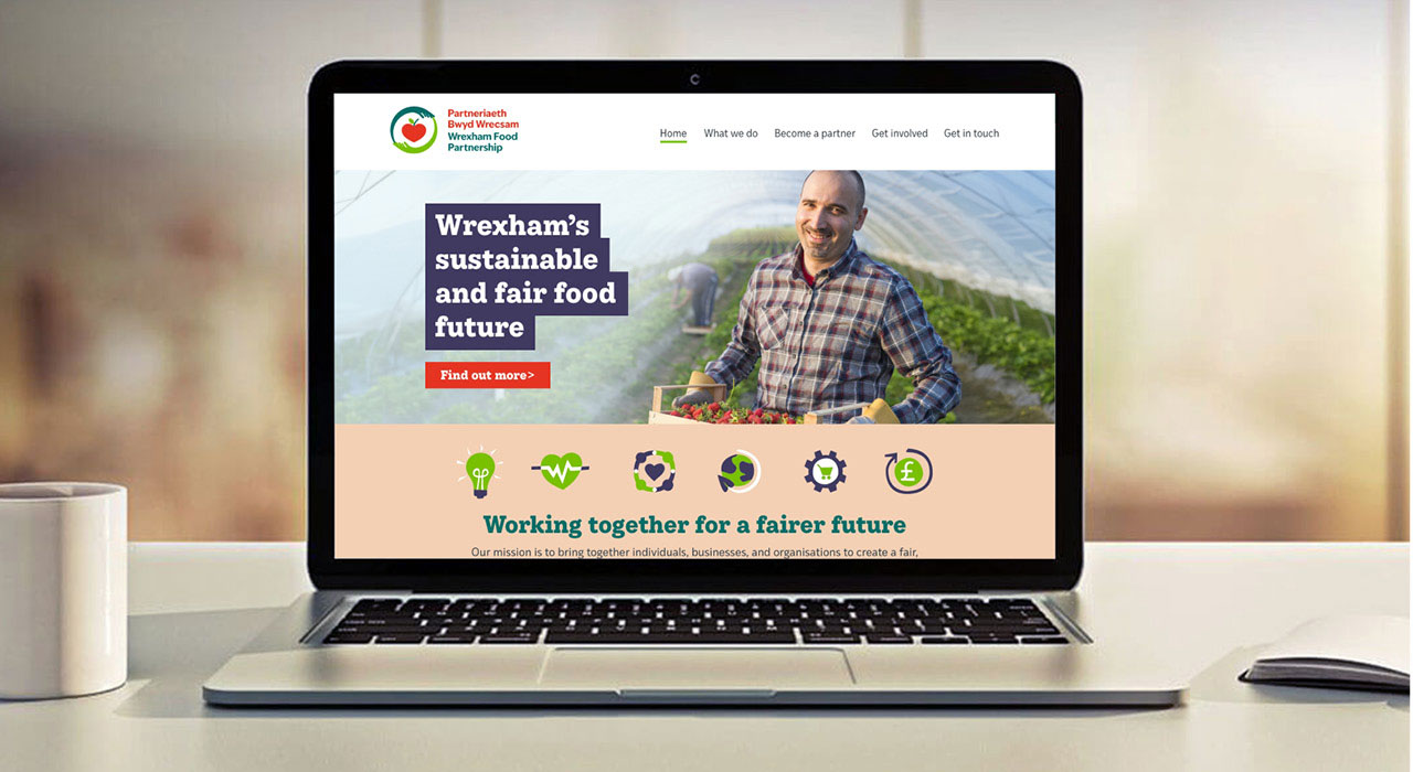
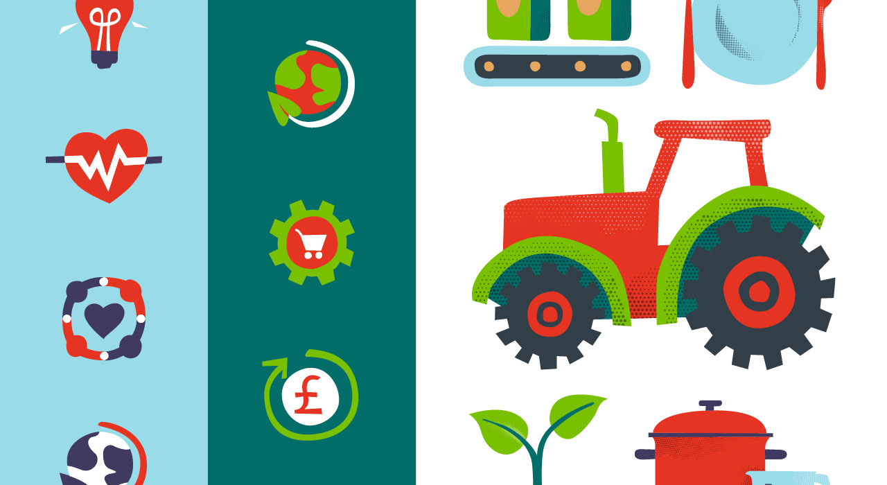
While the typography and logo have a structured but human appearance, this affords the icons and illustrations more space to give a fluid and flexible look.
The icons and illustrations use chunky, flat, hand-drawn shapes with the vibrant colour palette to enhance the personal and “getting your hands dirty” feel. The half-tone texture, adding highlights and shadows to the illustrations, increases that effect. To facilitate real change, the Partnership will be involved with individuals at organisations, businesses and in the community and this rustic look is in honour of that.
While many other food partnerships don't include much or any visual link to the geographical area they support, we've included a couple of references. For example, the leek in the shopping basket and local landmark Pontcysyllte Aqueduct are also subtle references to Wrexham's water supply, which enabled its rich history of beer production.

Result
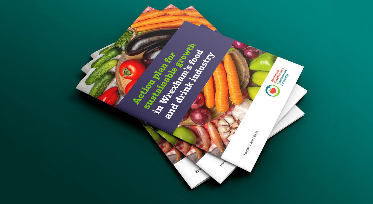
The branding tool kit has been distributed within the Partnership and Wrexham County Borough Council for use within all materials. The Partnership's steering group were involved in making choices during the design process. This helped ensure that the branding has been well-received throughout the Partnership, Wrexham County Borough Council and beyond.