Case Study
Training for Business
Branding refresh and long-standing relationship formed with established apprenticeship firm


Objective
Training for Business support companies with apprenticeships across the East Midlands and beyond, and has been established for three decades. Over time, their branding style had evolved but become less consistent. They approached Studio Bifrost as they needed a design partner they could trust to bring some perspective and deliver a fresh, consistent look to their Ofsted Outstanding firm. In addition, Training for Business were keen to form a long-term relationship so Studio Bifrost could handle the natural ebb and flow of creative requirements, some of which were time-sensitive.


Creative
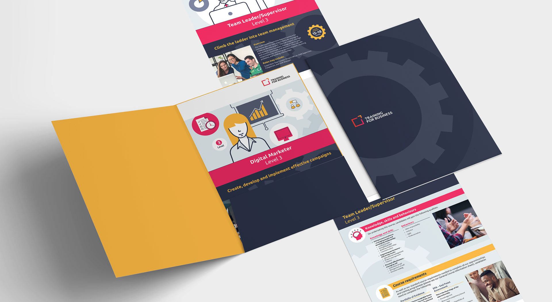
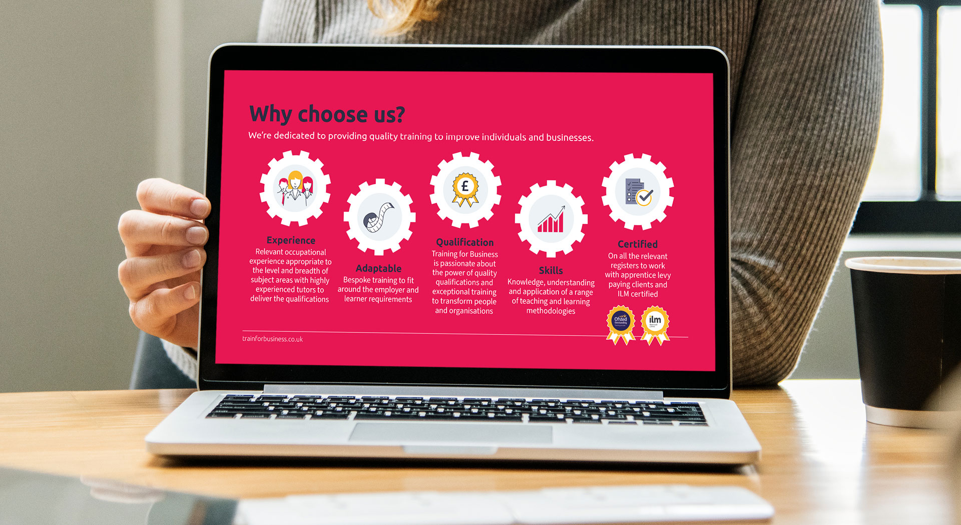
The logo offers a vibrant array of colours so to complement these, shades of dark blue were chosen for a professional and business like feel. The yellow and pink were taken from the logo as accent colours.
The font from the logo has been chosen as the headline font, as the curved forms of the letters give an approachable feel. We selected a modern, simple sans serif for the body text to compliment the headline font and give a clear and direct tone. Key words in the headlines have been highlighted in pink or yellow for emphasis.

Illustrations were chosen as the primary image style, in contrast to other training and apprenticeship providers, as they offer more longevity than photography of staff and apprentices. This route gives the opportunity to imply diversity without being tokenistic. We employed a simple line art style with splashes of the accent colours, for a functional, factual feel. The outlines used on some but not all shapes add personality and interest. The cog shape is used in backgrounds and as an enclosing shape, to tie layouts together and signify working together in a smooth and efficient way. Icons have been created to match the illustrations in style. They are used separately to and sometimes included in the illustrations to represent specific skills the apprentices will learn. Carefully selected stock imagery has been used to support the illustrations for a human feel.
Studio Bifrost have been hugely useful in every element, providing fresh ideas and very much working to our needs. I would 100% recommend without hesitation. Thanks to their fantastic service and creative minds we are continuing to work with them on future design requirements. I couldn't ask for better.
Charlotte Moreland
Managing Director, Training for Business


Result
After initially engaging with Training for Business on a few small projects, Studio Bifrost created the new branding style which first made its appearance on the six page sales leaflet. This was then rolled out across all materials including website update, course information sheets, folder and advertising. The new look helped cement Training for Business' reputation as a long established, professional training provider. Fresh sales materials have been used to help them grow their presence, winning them a raft of new and larger clients.
Our consistent and honest approach has lead to a lasting relationship with Training for Business, as their go-to design partner.