Case Study
Agility Marketing
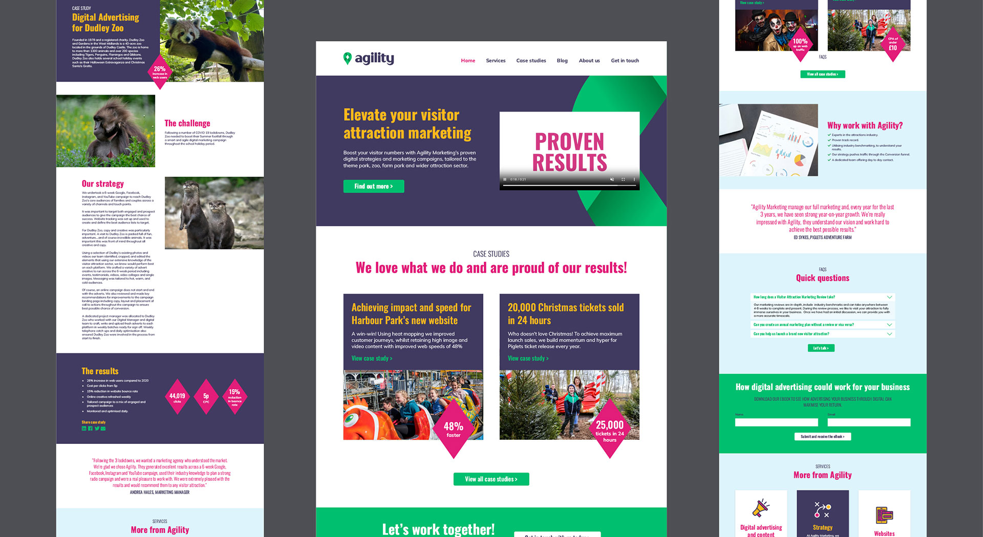
Full rebrand for well-established niche marketing agency


Objective
Agility Marketing is the UK's premier provider for tourist attractions. Agility was formed in 2001, by Managing Director Anita Waddell, after she cut her teeth in marketing at London Zoo and fell in love with the visitor attraction world.
Since their inception, Agility's team has grown to 12. They pride themselves on developing long-term relationships with their clients, with many working with Agility for over a decade and one for over 15 years! They also boast long-term relationships internally, with all their senior staff members being long-serving.
The firm was long overdue for a rebrand, having not refreshed its visual identity since its inception. It needed a new look to reflect its relationships, forward-thinking, energy, and boosts in visitor numbers and revenue that its clients have come to expect.

Creative
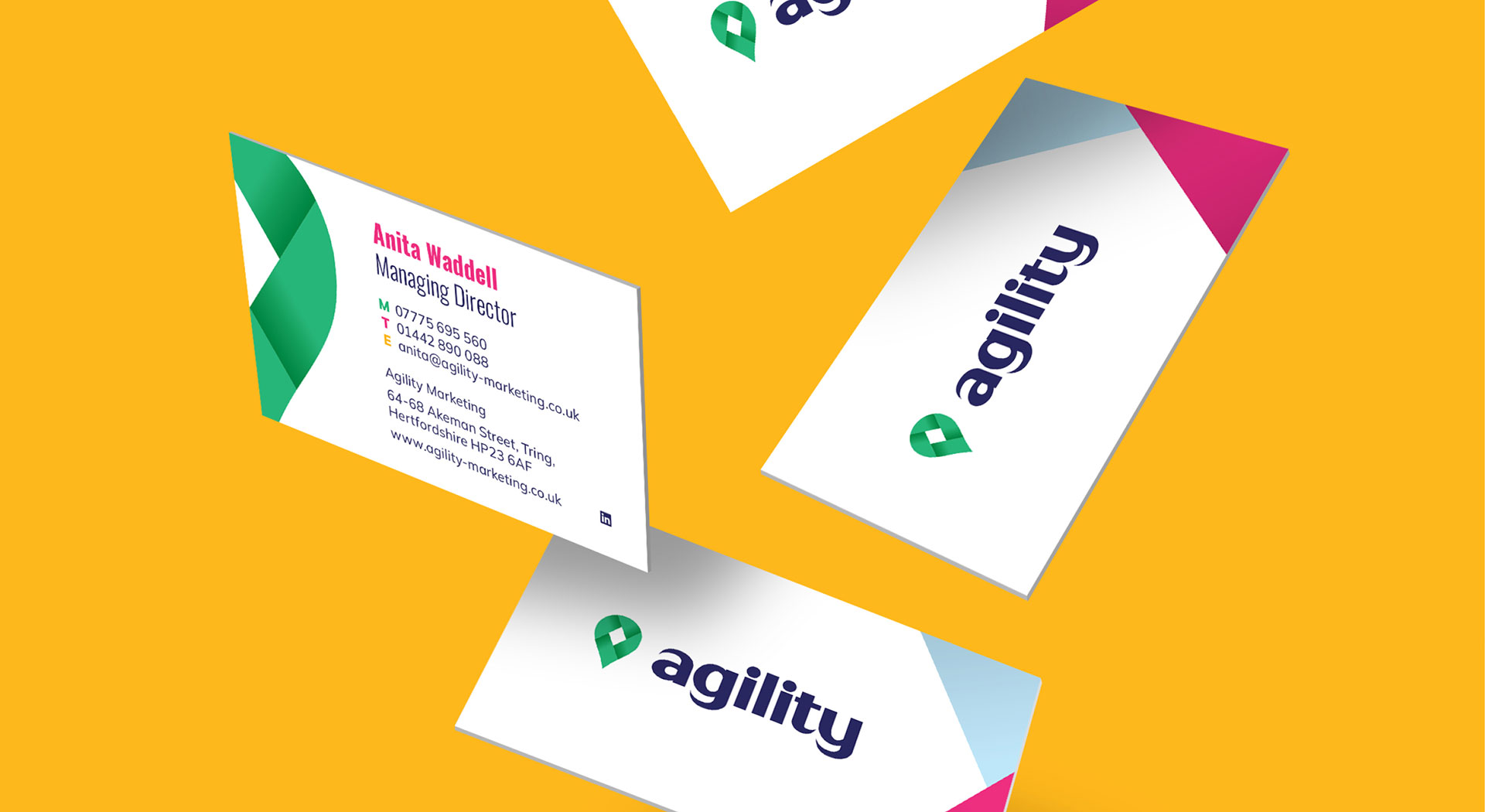
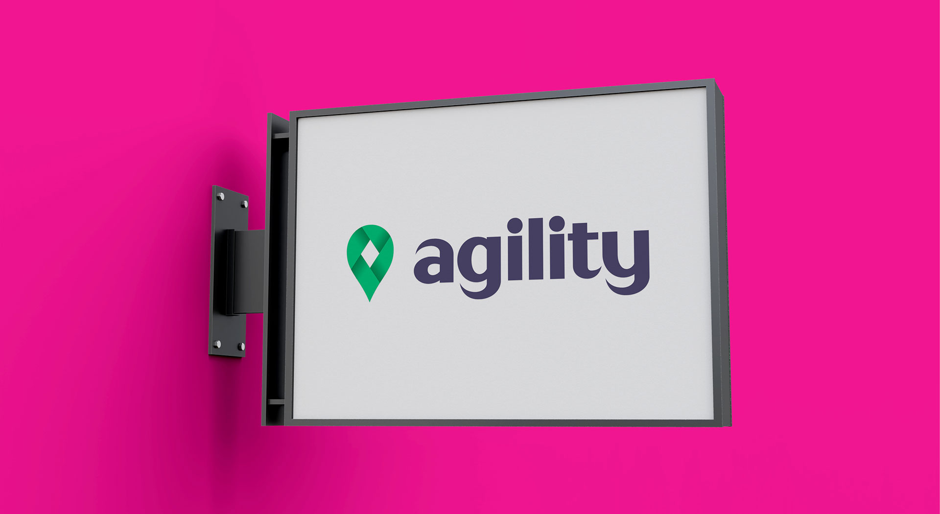
The new logo is a map pin symbol with a diamond in the centre, representing Agility’s services, putting their clients’ visitor attractions “on the map”. The diamond symbolises the high quality of expertise at Agility. This diamond is formed with four interlocking shapes. These give an interwoven feel, representing the harmonious, long-term relationships clients can expect to form with Agility.
In our research, we found that the vast majority of Agility’s competitors and other marketing agencies use sans-serif typefaces in their logos. The strokes of the letters usually have little contrast, and while these typefaces produce professional, clean-looking logos, many look very similar.
An easy point of difference for Agility in their branding is to use typefaces that are not sans serifs or, if used, are not uniform in stroke thickness.
Therefore, a customised sans serif has been created. The strokes vary in thickness, from chunky and solid to sharp points, to reflect the precision of the work Agility produces and link to the map pin icon. The letters are geometric and employ bold curves to mitigate any harshness for an approachable look. This also complements the simple forms of the icon.
Green is the focal colour that links with the original branding style. A fresh, vibrant shade has been chosen. In contrast, the logo's lettering is dark blue, which feels formal and professional.
Studio Bifrost recently undertook our rebranding project including website design for our niche marketing agency. Jenny really understood the brief and presented some great creative ideas. We are all really happy with our new brand and website now it is launched and would happily work with Studio Bifrost again.
Liz Dimes
Digital Marketing Director, Agility Marketing

One caveat for the design was that the fonts needed to be available from Google Fonts, so our search was focused there.
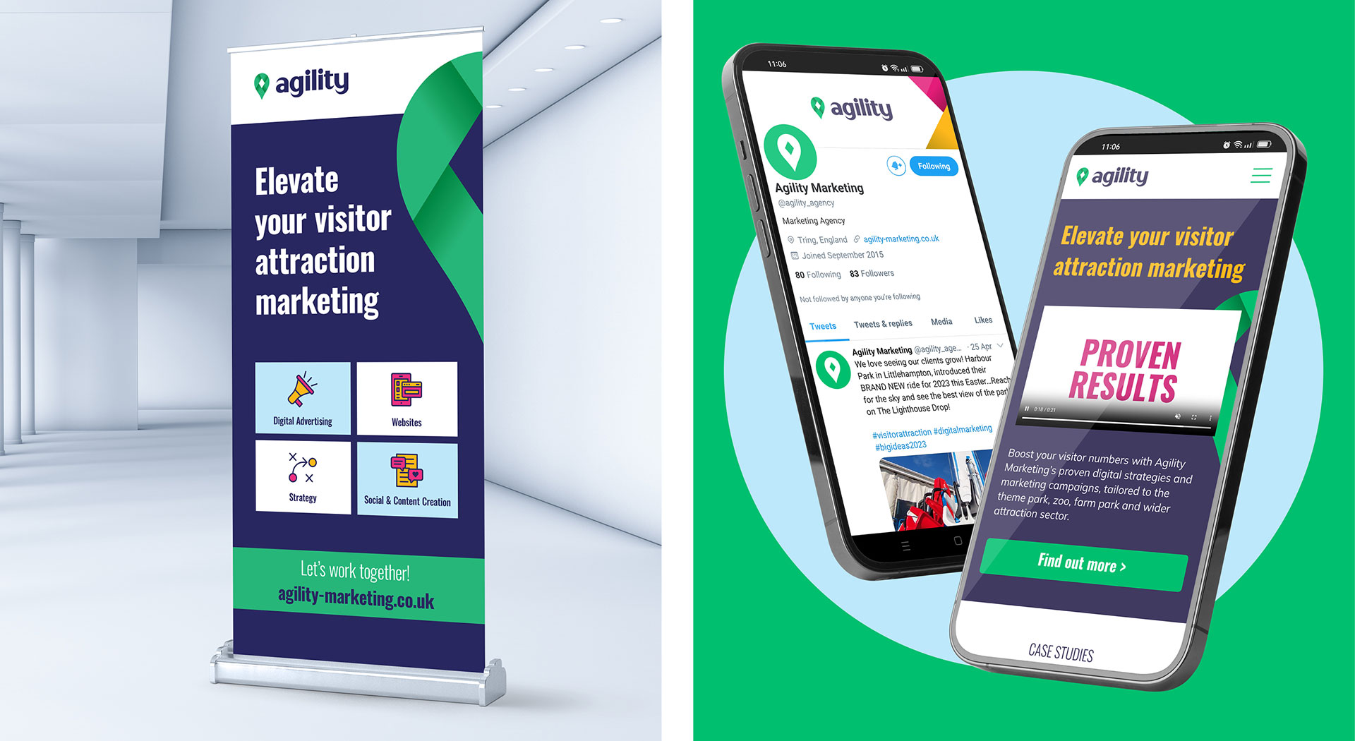
The chosen headline typeface is a bold, condensed sans serif. It adds an extra layer of authority to the new identity but maintains the balance by feeling friendly and personal due to the varied widths of the letter strokes.
We selected a rounded, geometric, approachable, but legible sans-serif typeface for the body copy.
Both typefaces complement the logo typeface by echoing its different features. This helps maintain the balance of expertise and quality with a warm, personal feel.
The supporting colour palette features zesty, impactful colours and a light sky blue for contrast. The sunshine yellow, grass green of the logo and sky blue reflect the outdoor world to signify the locations of many of Agility's clients and visitors leaving their homes for exciting days out at tourist attractions. Meanwhile, the bright pink adds excitement and energy, representing the experience of visiting an attraction and Agility’s passion for supporting the tourist attraction industry. Overall, the colours feel modern and fresh, with the dark blue of the logo tying it all together for a premium touch.
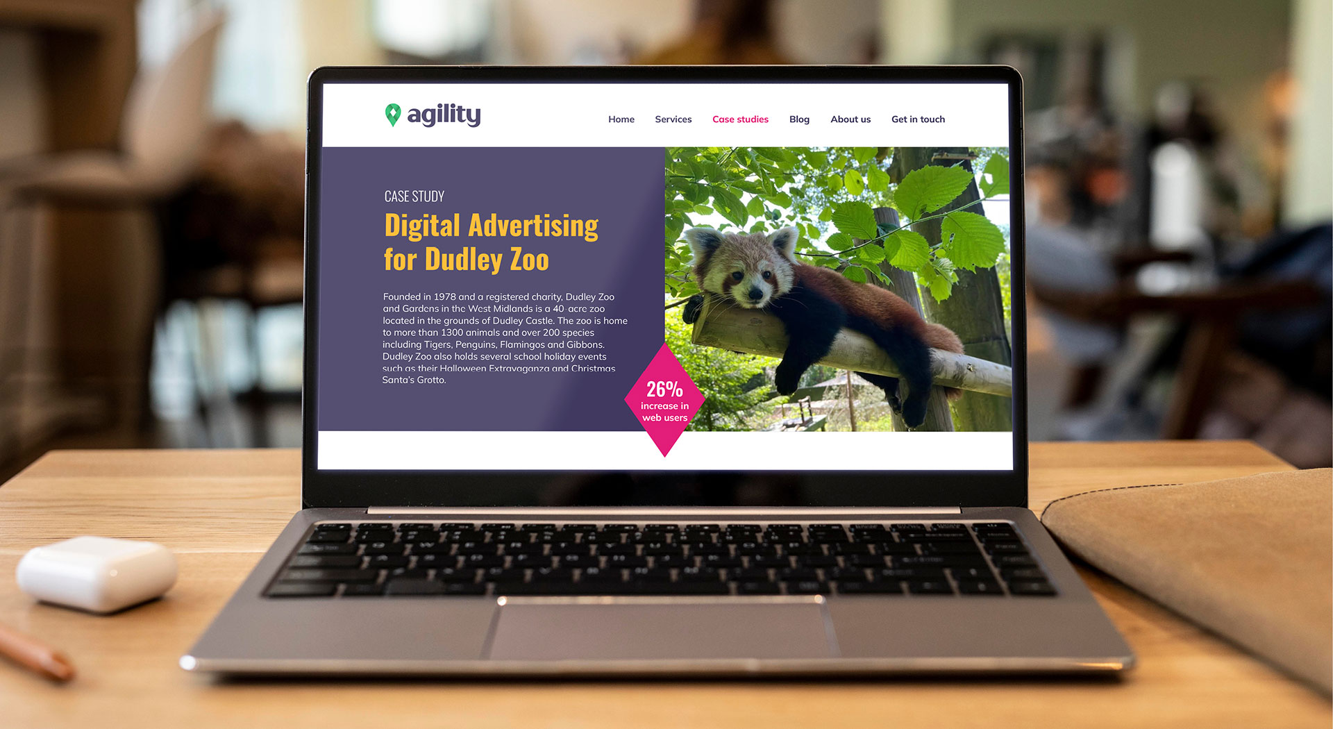
The rest of the branding style, across all touchpoints including their website has been left clean and simple, allowing the bold typography and vibrant colours to stand out. Attention has been paid to small details, like using the diamond shape from the logo as an enclosing shape for key pieces of information.
The interwoven map pin icon from the logo is also used separately as a graphic device to encourage brand recognition and to reinforce their commitment to putting their clients on the map with long-term relationships internally and externally.

Result
Agility are pleased and confident with their new visual identity. They are active members of the NFAN (National Farm Attractions Network) and were keen to launch their new look at the annual conference. Despite the conference occurring early in January, meaning working around Christmas leave, all collateral was completed in time so Agility could proudly present their new look at the conference. The new branding style, which has been set out in a guidelines document, will be used for all communications materials in the future.