Case Study
Access Group
Pushing the boundaries of an existing branding style to deliver a new campaign


Objective
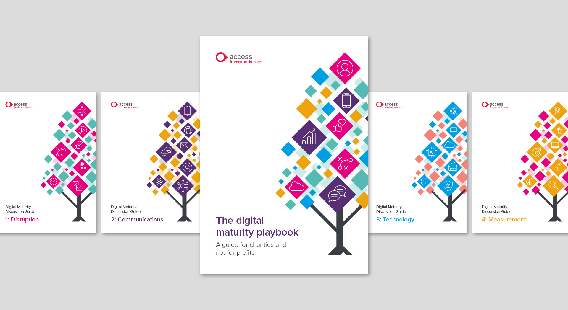
Access Group target specific markets to support them with business software solutions, one of them being the not for profit sector. During Covid, this sector was hit particularly hard as it highlighted that many organisations had been relying on outdated analogue processes or didn't have a strong digital presence. In addition, they couldn't run their traditional fundraising events, but online donations surged. Access wanted to help remedy this by producing a survival kit for digital fundraisers, to help them through Covid and beyond. Studio Bifrost were commissioned to create some of the visual assets.

Creative
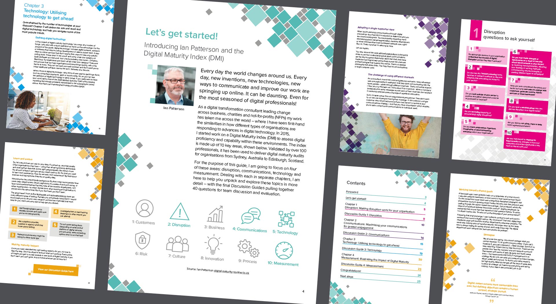
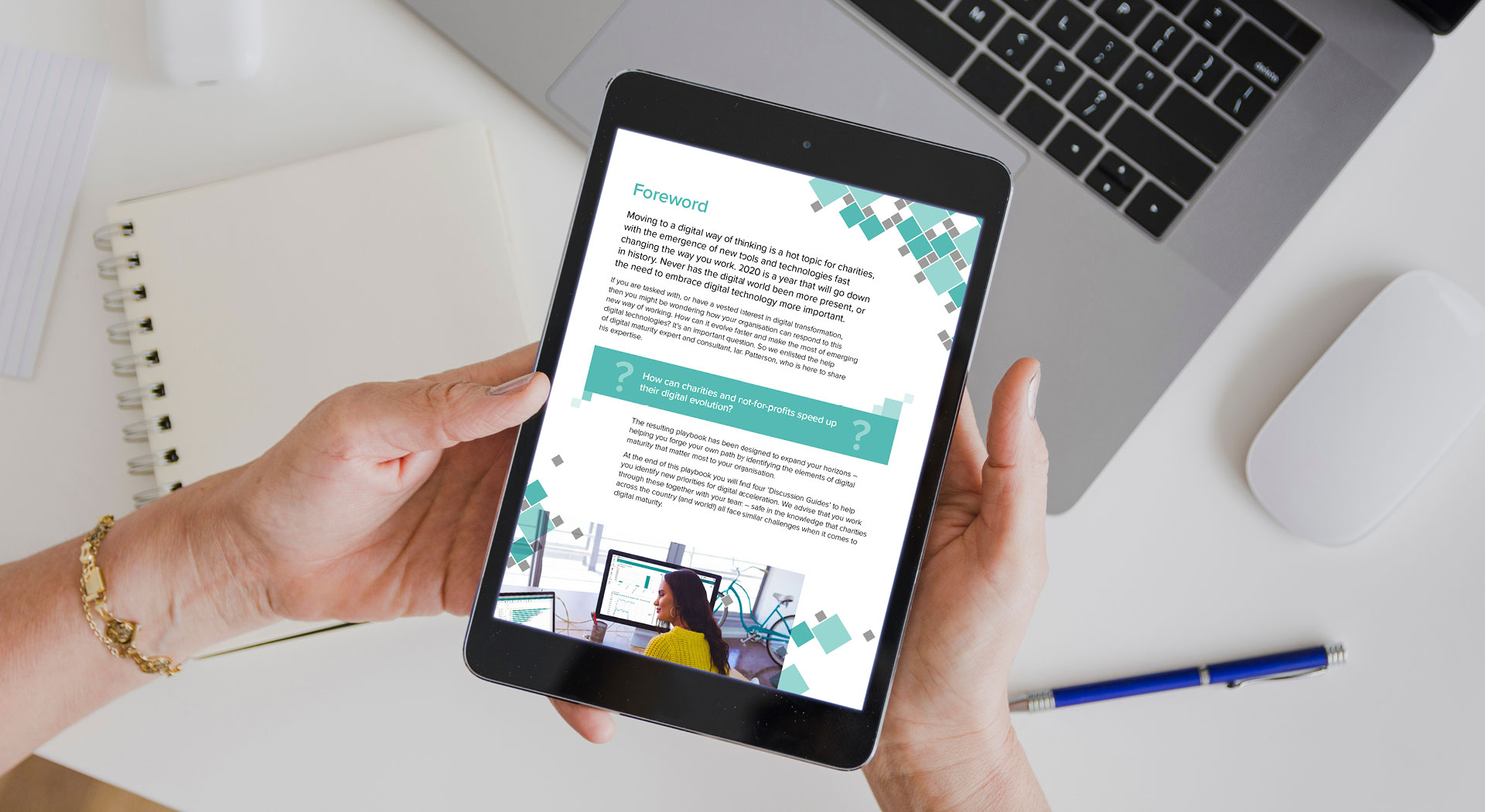
Studio Bifrost worked within Access' branding guidelines but pushed them as far as possible to establish an identity for the campaign under the Access umbrella brand. The campaign utilises a palette of bright, engaging colours to differentiate the sections, with shades of grey for consistency.
Squares were chosen as a clear link to the digital experience. Their variation in size and fluid nature of the positioning give a sense of movement and progress. Trees were selected for the covers of the e-books to signify growth and maturity. We chose to base the layouts on a strong but flexible grid, allowing variation on each page and to break up the content into digestible chunks.

Studio Bifrost has a great ability to work within brand guidelines but not let that limit creativity, I know how frustrating it can be to work within these constraints but rather than try to offer up something that would never be approved, they always produce work that is on brand… but not lacking in that extra creative edge you'd expect from using an external resource.
Alex Wortley
Divisional Marketing Manager, The Access Group


Result
We delivered a collection of materials that fit seamlessly with the rest of the Access branding style, while establishing a new campaign style to visually communicate the subject matter. The central piece is the visual playbook, set up as a downloadable PDF and split into smaller books. The colour coding for each section sets each book apart. In addition, we created a suite of digital assets for Access' in-house development team to apply the brand to the web page on Access' website.